Silicon Valley giant Google’s quarterly data release on the state of mobility across the world comes in as a handy tool to evaluate emerging trends in our transitory preferences. The data, which is anonymised and provides a wide range of statistics on an array of parameters, can prove to be of potent value while analysing and understanding human behaviour with respect to transit and migration in the long run. The dataset for new cases, alongside the mobility report, is publicly available.
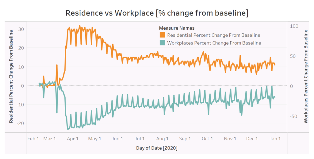
Let us start out with an insight with regards to residential stay versus office occupancy. The visualisation is almost near-perfect symmetric, reflecting the inverse relationship between the two parameters. In the immediate months following the lockdown in India, people started returning from their workplaces and camped at their homes or residences. This resulted in a significant shift in office occupancy, a reduction to the tune of ~-20%. Correspondingly, the residential percentage change from baseline went up about 30% before stagnating for a couple of months. We should also bear in mind that India, during this phase, had the highest Stringency Index score possible in the world- and that transgressions from the pattern, if any, are minor and negligible. By December 2020, however, people were returning to offices in pre-COVID volume, as is indicated by the metric touching the baseline once again.
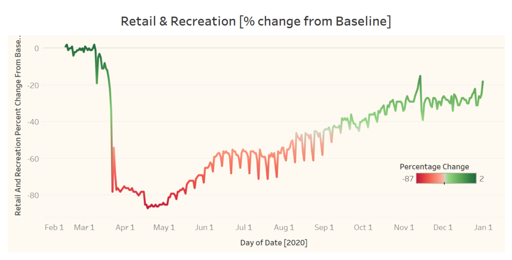
The second and the third graphic deals with percentage changes from baseline (pre-COVID times) with an eye on commercial establishments and commute. The retail and recreation sector had taken a particularly strong hit post the lockdown. While people flocked back to retail outlets, the same growth pace was not observed for recreational activities. The flattening of the curve around June-July phase demonstrates a tepid thirst for recovery at best. When curbs were eased further, the number of people visiting such centres also increased. The retail and recreational sector dropped to an all-time low of -87% in mid-April, when coronavirus concerns were rife and cases were spreading fast throughout India.
The transit graph also conveys a crucial tale. For a country as geographically extent as India, commuting to and from work comprises an essential ingredient of the majority of its workforce. Hence, the appetite for travel is always high. However, one of the fundamental premises of the lockdown was based on the fact that travel has to be curtailed at all costs. In a stroke, the railway machinery was brought to a grinding halt, and even airplanes cancelled their schedules from 25th March 2020. Left with no alternative, many were stranded- and those lucky managed to hike rides on buses and alternative modes of transport to reach their distant homes. The migrant worker crisis is what primarily fueled the spike in transit station visits, although post the initial few months, travel options were broadened and the Railways and the airlines were permitted to operate, although on strict conditions. This is reflected in the continual spike in demand for such transit stations.
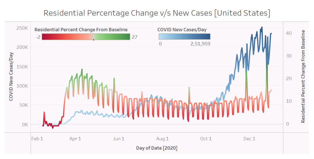
In the last graphic, I pit two variables against one another- the residential percentage change from baseline against the number of new COVID cases added to the tally everyday. I compare it for two countries- India and the United States. The United States had witnessed a huge upsurge in COVID cases around the July-August timeline, and it eclipsed the number of daily cases in the second wave as compared to India at that same point in time.
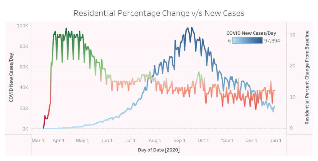
A curious pattern stands out in the case of India. While residential stay (which correlates with lockdown stringency) continued to plummet, the daily number of cases also attained a negative growth rate. It is generally expected that more the number of societal interactions, greater is the transmission of the virus and thus greater is the number of victims to be affected. However, the data defies logic, but is surprisingly reflective of our unique position in the global sphere. We appear to have tamed the first wave significantly quicker than other nations. The United States, in its second wave, observed two peaks in residential percentage figures, that helped smoothen the steep gradient it had taken post-October.